Dashboard
With Happy Desk built-in dashboard, you can track changes in customer sentiment over time and analyze trends in your support operations. This helps you identify areas for improvement and make data-driven decisions that will improve your customers’ experiences.
Cards
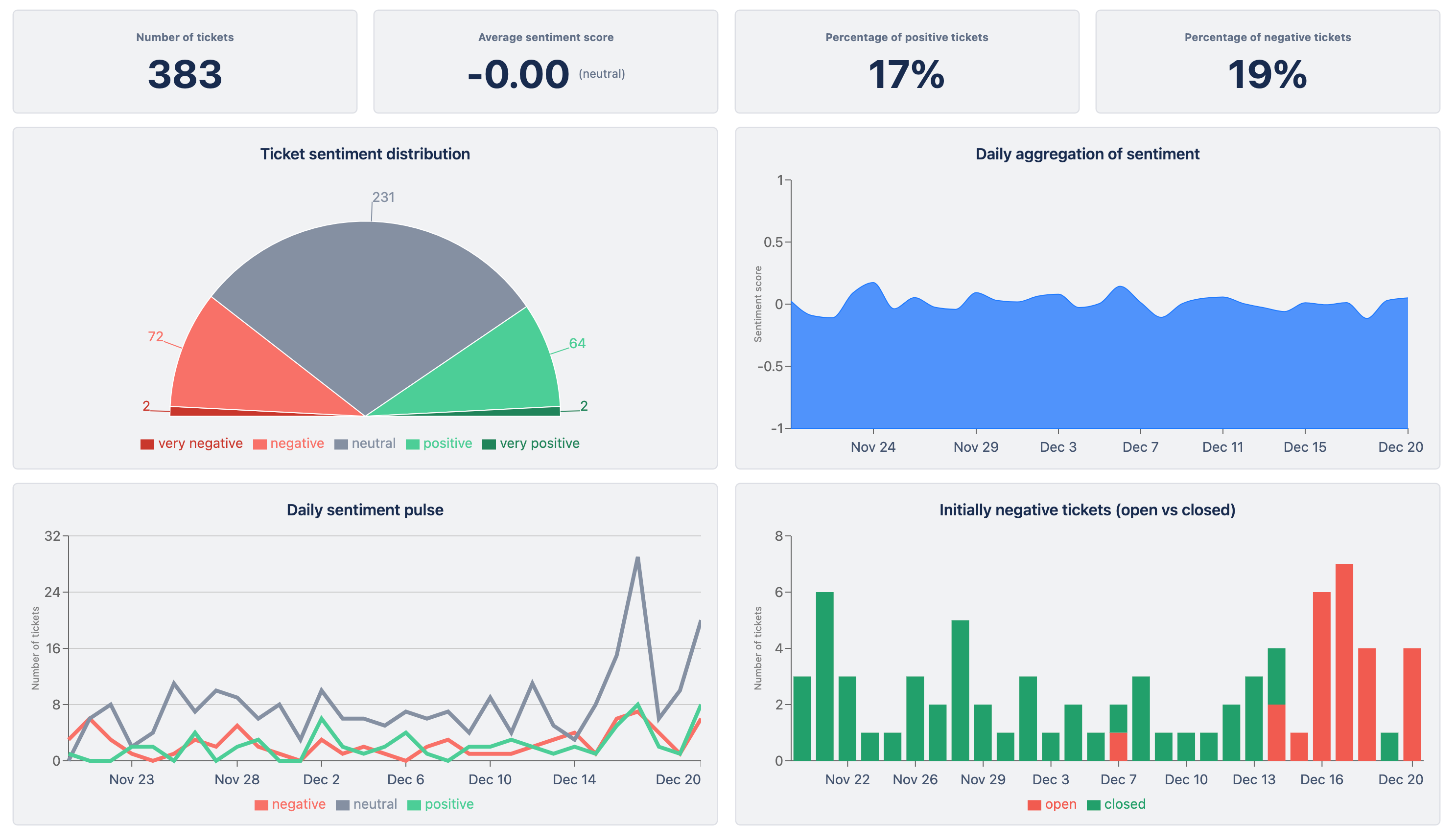
Number of tickets
Shows how many tickets are behind the dataset displayed in the dashboard.
Average Sentiment Score
Shows the mean value of sentiment score for all tickets.
Percentage of Positive Tickets
Shows how many tickets categorise as “positive” or “very positive” (score between 0.2 and 1).
Percentage of Negative Tickets
Shows how many tickets categorise as “negative” or “very negative” (score between -0.2 and -1).
Charts
Ticket Sentiment Distribution
Shows the number of tickets and their respective sentiment category.
This chart is also available as a Jira Dashboard Gadget!
Daily Aggregation of Sentiment
Shows the sentiment score broken down per day.
This chart is also available as a Jira Dashboard Gadget!
Daily Sentiment Pulse
Shows the number of tickets in positive, neutral, negative categories per day.
Allows users to gauge progression of sentiment across tickets per day. This can help identify emerging trends in sentiment.
Score explanation: Positive (0.2 to 1), Neutral (-0.2 to 0.2), Negative (-0.2 to -1).
This chart is also available as a Jira Dashboard Gadget!
Initially negative tickets (open vs closed)
Shows the number of initially negative (score between -0.2 and -1) created per day and whether they are open/closed.
Allows users to track whether they are resolving issues for customers with negative sentiment in a reasonable timeframe.
This chart is also available as a Jira Dashboard Gadget!
If there is something else you would like to see, let us know!